
Designing the visual language
of John Deere digtial.
I’m a UX designer focused on design systems: components, icons, typography, guidelines, and the cross-surface infrastructure that keeps a 187-year-old company visually coherent across web, mobile, and print. The two case studies below are zoom-ins on that broader work at John Deere.


ROLE
UX Designer II
Design System Designer
TENURE
Dec 2023 - Present
2.6 years at John Deere
REACH
20+ product teams
3 business unit
SURFACES
Web · Mobile · Print
One coherent language


ABOUT THE COMPANY
187 years old.
130 countries.
One digital surface.
I joined John Deere in December 2023 as a UX designer II on the Mobile & Web design systems team, the small group responsible for the components, icons, typography, and documentation that 20+ product teams build on.
My role spans the unglamorous infrastructure work - auditing existing patterns, defining new primitives, writing usage rules, and pairing with engineering until what ships matches the spec. The case studies below zoom into two of the deepest projects on that surface.

THE DIGITAL DESIGN SYSTEM
One foundation. Twenty Product teams.
A comprehensive design foundation powers every customer-facing application at John Deere - from Ops Center to Equipment Mobile, dealer portals, and internal tools. Over 2.6 years, I contributed to its evolution across three pillars.

Systems thinker
I work in patterns, tokens, and primitives, not pages. If two surfaces need the same thing twice, that's a missing component, not a duplicate task.
Cross-surface fluency
Web, native, and print are different mediums with different unit systems. The same component model has to translate cleanly across all three.
Design–engineering pairing
Parity isn't earned in Figma, it's earned by sitting next to the engineer until the rendered output matches the spec. I keep that loop tight.
WHAT I WORK ON
The system, in six initiatives.
My day-to-day spans the full surface of John Deere’s design system — the two case studies below are the deepest, but here’s the full picture of where my work shows up.
CASE STUDY 04
iPad Layout Patterns
Net-new territory
Defined the first tablet-specific layout patterns, login & home navigation with templates & guidance on what works and what doesn't on iPad. Referenced by many tablet & mobile designers ahead of component release.
CASE STUDY 05
Guidelines & Documentation
Reference library
Authored usage rules, accessibility notes, and adoption playbooks. Unglamorous, but it's the work that keeps a global enterprise from re-litigating the same decisions every quarter.
CASE STUDY 03
Component Contributions
20+ teams consuming
Audited, refined, and published components in the ISG Component Library, the layer every product team imports from. Kept Figma and the repo in sync as a single source of truth.
CASE STUDY 06
Tokens & Foundations
Cross-surface
Contributed to the shared color, spacing, and elevation tokens that underpin every component and the token bridge that keeps web and print speaking the same language.
CASE STUDY 01 - EQUIPMENT ICON SYSTEM
01 - Rebuilding
the equipment
icon system.
I redesign equipment icons used across John Deere’s digital ecosystem - replacing toy-like, inconsistent artwork with a precise, scalable system grounded in real product photography.
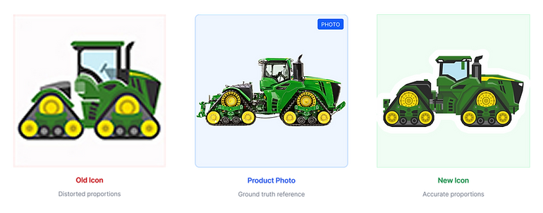
The same 9RX tractor rendered in the old system, in the product photograph it represents, and in the redesigned icon.
THE TEAM
A two-designer pod, serving many
product teams.
Over 2.6 years, our two-person design team redesigned 1000+ icons including 140+ equipment icons, shipped 100+ components, and rebuilt the contribution models, request models so the system could keep up with the org.
MY ROLE
01
Led visual designs for Report Library and Icon systems for ISG Digital library.
02
Authored Research and documentation for usage guidelines
03
Worked with engineering for design-to-code fidelity and delivery
04
Supported product teams adopting the systems

BAILEY HIGGINS (L) . SHREYA JAIN (R)
MARCH 2025
THE PROBLEM
Why this matters.
The Operations Center has Home, Map, Setup, Plan & Analyze tools where farmers, dealers, and technician's daily workflow lives in. It surfaces up to 60 icons on average on a single screen. Out of which one-third are equipment icons. When those icons misrepresent the equipment they stand for, trust erodes fast.
"There's a big product launch in the construction division history for our JD designed excavators. Please match all icons so it wouldn't take the historical style & form"
- Global product manager, JD Construction & Forestry
"When a farmer calls about their 9RX tractor, the icon needs to match what's in their field."
- Dealer support lead, internal interview
"Existing icons were squashed to fit a square. A combine read like a child's toy, not a $750K machine."
Distorted Proportions
On average, a single Operations Center Home screen contains around 60 icons. Nearly one-third of them are equipment icons.


AUDIT & PRIORITIZATION
We didn't redesign randomly.
With the help of engineering team, we pulled 90 days of usage telemetry from the Operations Center and ranked every icon by appearance count. The top 12 icons accounted for 78% of all impressions, they shipped first. Strategic impact: Shipping high-usage icons first delivered visible improvement to 500K+ users within 8 weeks, while the long tail followed a documented system anyone could extend.

MY APPROACH
Three principles. Every decision.
Before drawing anything, I aligned the team on the principles below. They became the rubric we used in every review.
Accuracy Over Aesthetics
Icons must represent real equipment models and proportions. A beautiful icon that misrepresents the machine confuses customers and erodes trust.
"When a customer calls about their 9RX tractor, the icon needs to match what's in their field."
Optimize for Recognition
Users scan dashboards at 24px. Exaggerate distinctive features (tracks, booms, headers) while reducing non-essential detail.
"If you can't tell a combine from a sprayer at thumbnail size, it's not working."
Enable Others to Succeed
Documentation, templates, and guidelines allow designers and engineers to extend the system without bottlenecking on one person.
"The system is successful when I'm not needed to create the next icon."
VISUAL RULES & LOGIC
The system itself.
The real work of a design system is the constraints. I defined a 48×48 base grid, pixel-snapping rules, and a callout pattern that lets any designer draw a new machine without inventing a new style.
Visual Rules & Logic
The core of design systems work, establishing constraints that enable consistency at scale.

- All icons live on a standard art board with pixel-snapping enforced.

Every shape is kept intact in a working file for any future changes.

Shared parts were drawn only once, resued everywhere.
PROCESS
Process & Workflow
A scalable process that reduces rework and lets the team work in parallel. Each icon passes through the same nine gates.

ITERATIONS & TRADE-OFFS
What I got wrong, and what I changed.
The strongest signal that a system is working is how it survives its first contradictions. Three of the calls that took the longest to make:


OUTCOME & IMPACT
What it shipped, what it changed.
The system is in production and self-sustaining. Most importantly, the next icon doesn't need me.
140+
Equipment icons shipped
Live in Figma library & Storybook
7 days
New icon turnaround
Down from 15 - 20 days a/c pre-system
500k+
Users impacted
Operation Center monthly actives
New System
Style Guidelines & New workflow system created
Nothing ever existed before.
91%
Recognition accuracy
Up from 54% from previous launch
AI efficient
To be efficient we used VS Code to optimize our SVG files.
Constantly exploring AI tools & agents to drive innovation.


REFLECTION
What I'd do differently.
Start with system, not the first icon
I spent three weeks polishing the row-crop tractor before locking the grid rules. When the rules tightened, I rebuilt it. Next time the constraints come first, the hero icon second.
Bring stakeholder in at week one.
Prioritizing conventions came up late. A 30-minute conversation with the platform stakeholder in week one would have saved a week of cleanup later.
UP NEXT
Teaching a web system to speak print. Building reusable PDF report components for ISG digital teams.